Real-time use case clientlibs
1. Requirement:
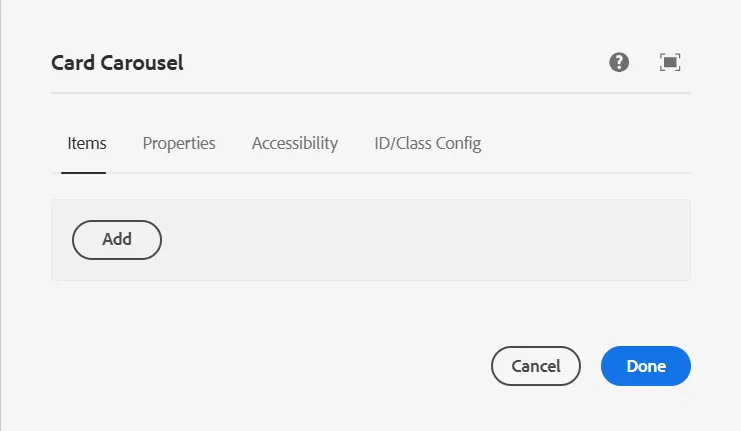
We need to create an enhanced carousel component that extends the Core Carousel Component with the following rules:
- The carousel must allow a minimum of 3 items and a maximum of 5 items.
- The validation should be enforced at the dialog level.
2. Solution
To achieve this, follow these steps:
- Extend the Core Carousel Component
- Create a new component that extends the Core Carousel Component (
/apps/core/wcm/components/carousel).
2. Copy the Dialog from the Core Component
- Copy the dialog structure from the core component and modify it as needed.
- Implement validation logic to restrict the number of allowed items.
3. Create a Clientlibs Folder
- Inside your component, create a
clientlibsfolder to hold custom JavaScript and CSS. - Define a
cq:ClientLibraryFoldernode with the necessary categories.
4, Write Custom JavaScript for Validation
- Add a JS file inside the
clientlibsfolder. - Implement logic to enforce the 3 to 5-item rule dynamically within the AEM dialog.
5. Include Core Component Clientlibs
- The Core Carousel Component has its clientlibs.
- To ensure that both the core and custom clientlibs are loaded properly, add the core component’s clientlibs to
extraClientlibsin your component’scq:dialog. - This ensures that the necessary JavaScript for the Core Carousel functionality is also included.
3. Implementation:
Step 1: Create a Custom Component
Navigate to your project and create the component under:/apps/yourproject/components/yourcomponentname
This component should extend the Core Carousel Component

<jcr:root
    xmlns:jcr="http://www.jcp.org/jcr/1.0"
    xmlns:cq="http://www.day.com/jcr/cq/1.0"
    xmlns:sling="http://sling.apache.org/jcr/sling/1.0"
    cq:icon="imageGallary"
    cq:isContainer="{Boolean}true"
    jcr:primaryType="cq:Component"
    jcr:title="Image Gallery"
    sling:resourceSuperType="core/wcm/components/carousel/v1/carousel"
    componentGroup="Custom - Content"/>
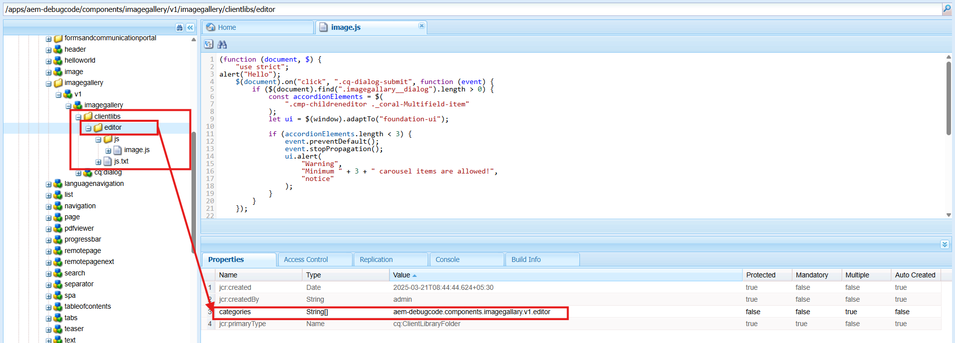
Step 2: Create a Clientlibs Folder
Inside your component, create a clientlibs folder for custom JS.
Step 3: Define Categories in clientlibs
Set up cq:ClientLibraryFolder and mention the category name inside .content.xml
<jcr:root
    xmlns:jcr="http://www.jcp.org/jcr/1.0"
    jcr:primaryType="cq:ClientLibraryFolder"
    categories="[yourproject.components.carousel]"/>
Step 4: Copy & Modify the Core Component’s Dialog
Since we need custom validation, we copy the dialog from the Core Carousel component and modify it.
4. Why Copy?
- The Core Component has built-in clientlibs for its dialog.
- We need to retain those clientlibs and add our own.
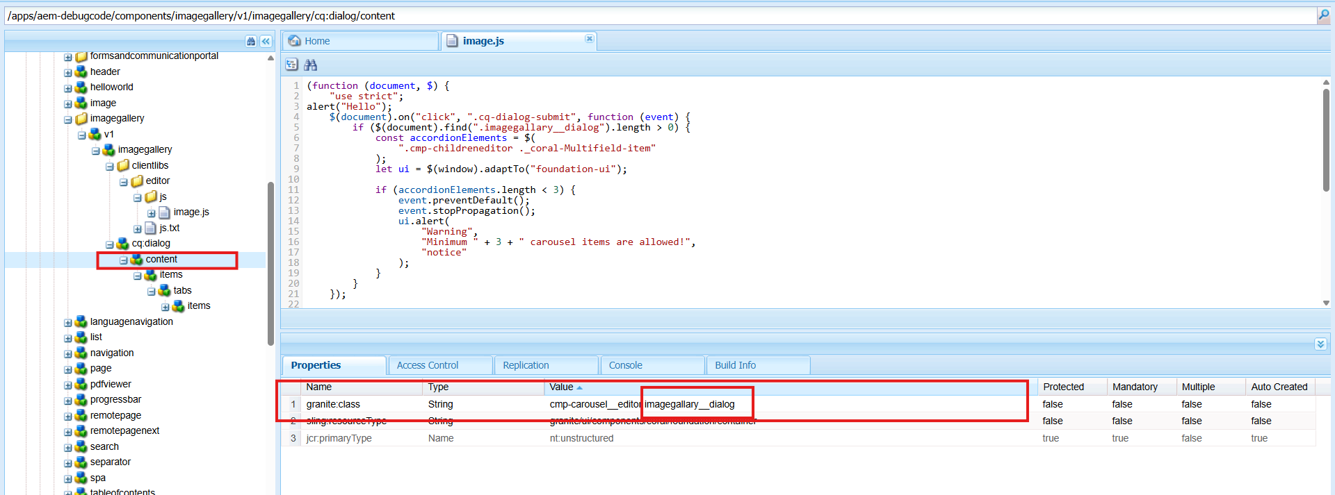
- We also need a unique class name (
granite:class="cmp-carousel__editor imagegallary__dialog") for validation.
You can see below I have added a class name inside the granite:class.
<jcr:root
xmlns:jcr="http://www.jcp.org/jcr/1.0"
xmlns:granite="http://www.adobe.com/jcr/granite/1.0"
jcr:primaryType="nt:unstructured"
jcr:title="Enhanced Carousel"
sling:resourceType="cq/gui/components/authoring/dialog"
extraClientlibs="[core.wcm.components.commons.editor.dialog.childreneditor.v1,core.wcm.components.carousel.v1.editor,yourproject.components.carousel]">
<content
granite:class="cmp-carousel__editor imagegallary__dialog"
jcr:primaryType="nt:unstructured"
sling:resourceType="granite/ui/components/coral/foundation/container">
</content>
</jcr:root>
Important:
When extending a Core Component, always copy all extraClientlibs values from the Core Component. If not, your component might break.
Step 5: Implement Clientlibs Custom JS Code for Validation
Create a new JavaScript file inside your clientlibs folder:
/apps/yourproject/components/yourcomponentname/clientlibs/js/validation.js
Custom JavaScript for Validation:
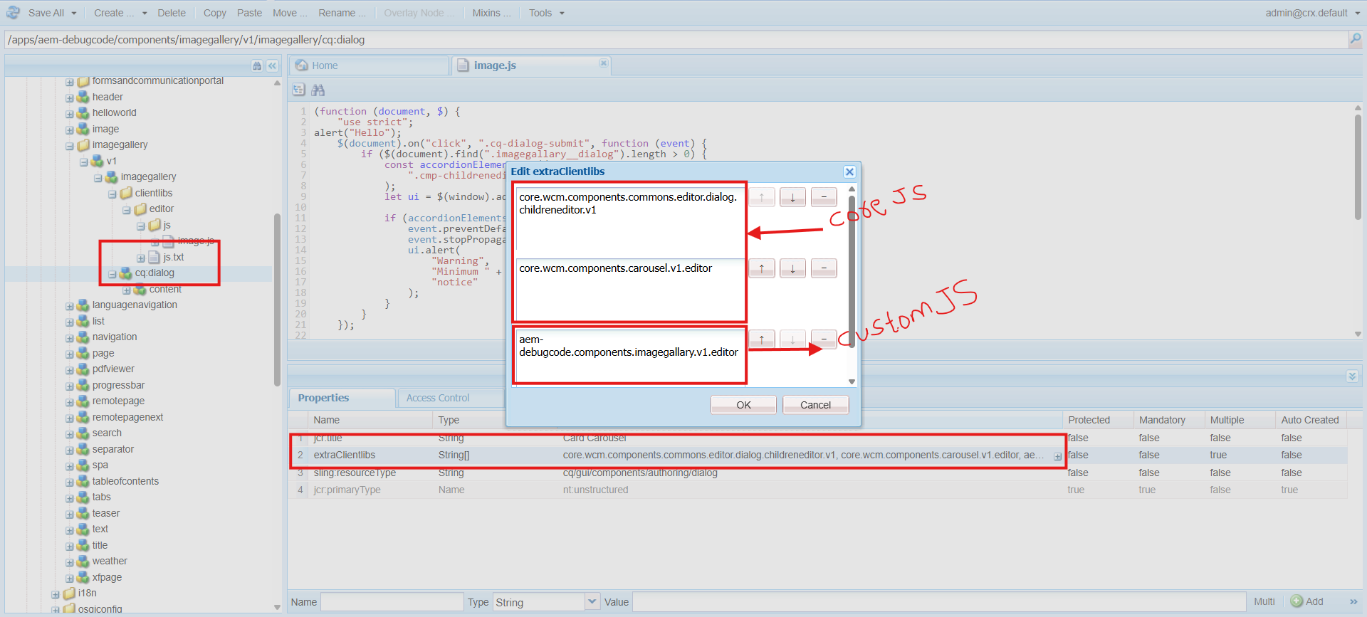
Clientlibs Custom JS Code:
(function (document, $) {
"use strict";

    $(document).on("click", ".cq-dialog-submit", function (event) {
const dialog = $(".lifestyleaccordion__dialog");
if (dialog.length > 0) {
const accordionElements = dialog.find(".cmp-childreneditor coral-multifield-item");

let ui = $(window).adaptTo("foundation-ui");

if (accordionElements.length < 3) {
          event.preventDefault();
          event.stopPropagation();
          ui.alert(
"Warning",
"Minimum 3 Accordion items are required!",
"notice"
          );
        }
      }
    });

    $(window).adaptTo("foundation-registry").register("foundation.validation.validator", {
selector: ".cmp-childreneditor",
validate: function (element) {
if ($(element).closest(".lifestyleaccordion__dialog").length > 0) {
const multifield = $(element);
const items = multifield.find("coral-multifield-item");
const max = 5;
const ui = $(window).adaptTo("foundation-ui");

if (items.length > max) {
            items.last().remove();

            ui.alert(
"Warning",
"Maximum 5 Accordion items are allowed!",
"notice"
            );
          }
        }
      }
    });

  })(document, Granite.$);
Step 6: Testing the Component
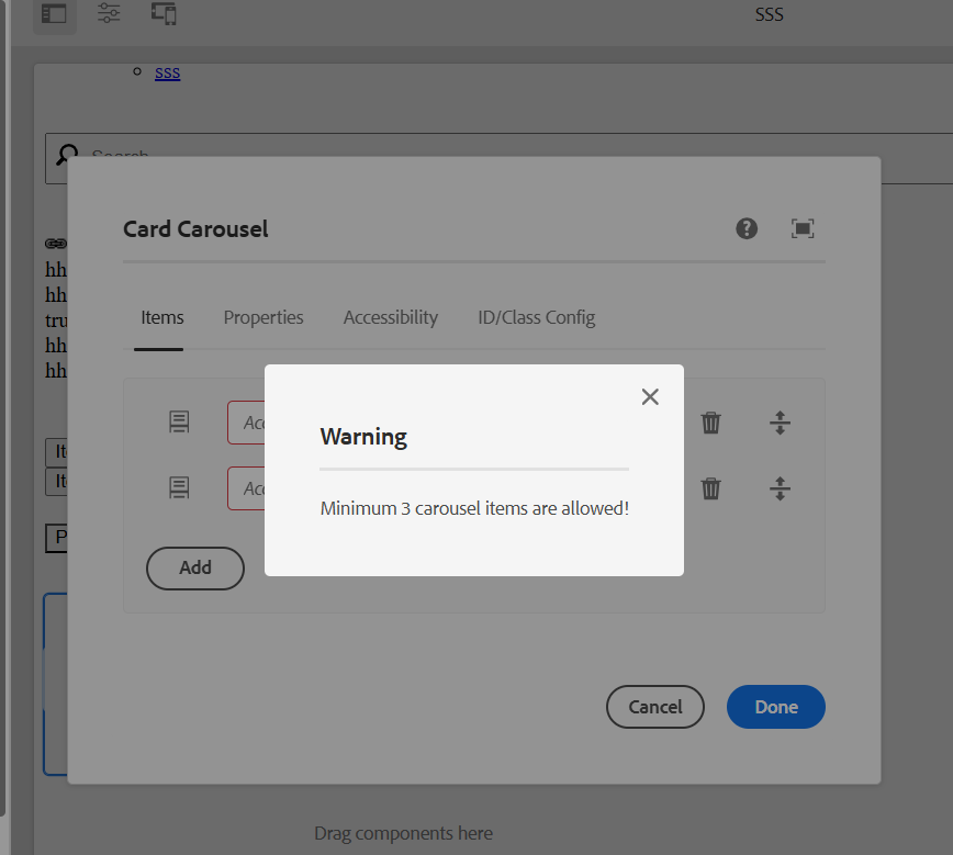
6. Scenario 1: Adding Less Than 3 Items
- Open the component dialog.
- Add only 2 items and try to submit.
- You should see an alert preventing submission:
"Maximum 3 carousel items are allowed!"
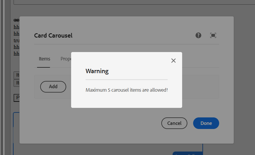
7. Scenario 2: Adding More Than 5 Items
- Open the component dialog.
- Add 6 items and try to submit.
- You should see an alert preventing submission:
"Maximum 5 carousel items are allowed!"
Key Takeaways:
- Using
extraClientlibsensures that the required JavaScript from the Core Component is available alongside custom scripts. - Properly structuring the clientlibs prevents issues where core functionalities do not load.
- This approach allows for custom enhancements without breaking the base Core Component functionality.
Every great discussion starts with a simple thought! If you enjoyed this article, found it useful, or have any questions, let’s talk! I’d love to hear from you.
For more updates, tips, and engaging conversations, connect with me on Medium and LinkedIn. Let’s keep learning together! 🚀✨
Thank you 🙏 !

