AEM Template Complete Guide
1. What is an AEM Template?
The template is a starting point for creating pages in AEM. Think of it like this, every time you make a new page, it follows the structure defined by the template.
If you’ve worked with any CMS before, you know how frustrating it can be when every page is built differently. AEM templates solve that by keeping things consistent. Instead of manually adding headers, footers, and layouts every time, you just pick a template and create your page, and good to go.
AEM offers two solutions to meet developer and content author needs, balancing flexibility, control, and ease of use.
2. Why Do We Need Templates in AEM?
- Consistency Across Pages — Every page follows the same structure, keeping the design uniform.
- Faster Page Creation — No need to manually build layouts every time. Just select a template and start adding content.
- Less Developer Dependency — Authors don’t have to rely on developers for minor changes.
- More Control Over Content — Developers can enforce structure, while authors can still modify content as needed.
- Scalability — When managing large websites, templates make it easier to create and maintain hundreds (or thousands) of pages.
3. Types of AEM Templates
AEM has two main types of templates: Static Templates and Editable Templates. Both have their purpose
a. Static Templates — The Developer-controlled structures
Static templates are the traditional templates that have been used in AEM. If you’ve worked with older versions of AEM, you’ve probably come across them. These templates are fully managed by developers, meaning content authors can’t change their structure.
Here’s how they work
- Defined in Code — Everything is stored in the JCR (/apps folder), and updates require a developer.
- Fixed Structure — What you see is what you get. Authors can’t re-arrange or add new components.
- No Built-in Responsiveness — Developers have to manually code how the template adapts to different screen sizes.
- Used for Strictly Controlled Pages — Ideal when you don’t want authors changing layouts.
A static template is typically stored as a .content.xml file, which includes details like
- The resource type of the page component
- Default components (e.g., header, footer, paragraph system)
- Any restrictions on what authors can do
Once a page is created from a static template, it’s copied into the JCR, meaning any future changes to the template won’t affect existing pages.
b. Editable Templates — More Flexibility for Authors
AEM introduced Editable Templates in version 6.2 to give authors more control. Unlike static templates, these can be modified without a developer’s help using the Template Editor.
Why use editable templates?
- Flexible & Author-Friendly — Authors can update layouts, add new components, and control page structure.
- Template Policies — Developers can still define rules e.g., what components are allowed for the template.
- Responsive by Default — Works well across different screen sizes without extra coding.
- Live Updates — Changes to the template structure immediately reflect on all pages using that template.
Editable templates don’t exist in /apps like static templates. Instead, they are stored under /conf, making them easier to manage without touching code.
Which One Should You Use?
- If you need a strictly controlled page structure that won’t change, go with Static Templates.
- If you want more flexibility for authors and easier page management, Editable Templates are the way to go.
4. Key Components of an AEM Template
- Template Type: Defines the base structure.
- Policies: Control design and behavior of components.
- Initial Content: Predefined content structure.
- Structure: Defines the layout and components.
- Content Policies: Define allowed components and their configurations.
- Page Policies — Defining Page-wide Rules
5. Editable Template Workflow & Pages Relationship
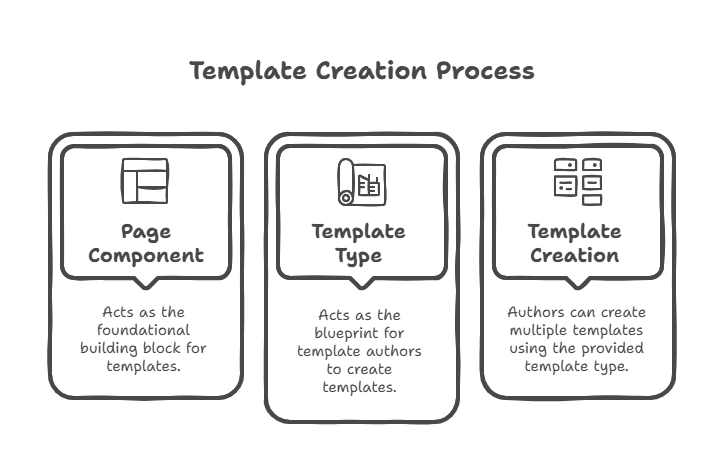
Editable templates in AEM work in a way where both developers and template authors have their roles. Developers set up the structure, and authors use that to create templates that content creators can work with creating pages.
6. Developer Responsibilities
a. Page Component
- Acts as the base for templates, containing scripts and configurations needed for functionality.
b. Template Type
- Developers create this using the page component. It defines the basic structure that template authors will use
7. Author Responsibilities
a. Template
- Created by template authors using a template type.
- Define layout settings, pre-existing components, and content structure.
- Static connection with the template type → Changes in the template type do not affect already created templates.
b. Pages
- Generated from templates and inherit the predefined structure.
- Contain layouts and components set at the template level.
- Dynamic connection with templates → Any updates in a template are reflected on all associated pages. –
8. Dynamic Relationship.
- Templates dynamically influence the pages created from them e.g., layout or component updates in a template reflect on all associated pages.
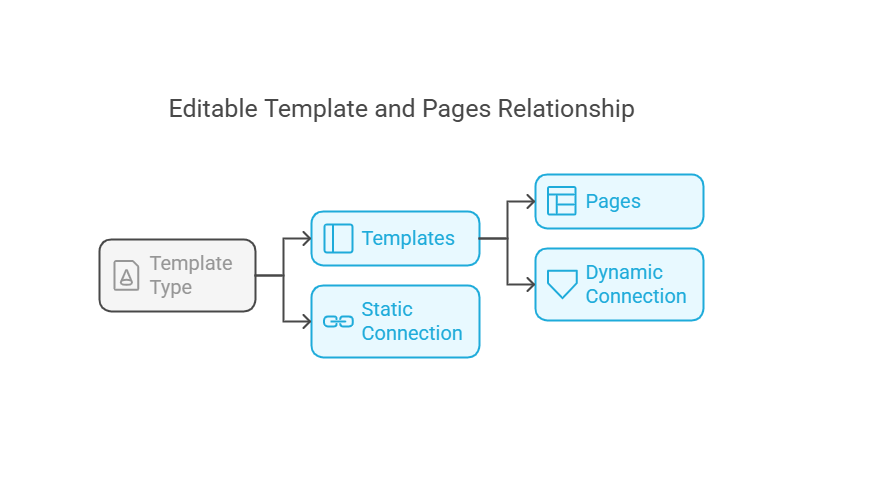
Hierarchy Summary.
- Template Type → Creates → Templates.
- Templates → Generate → Pages.
- Each layer impacts the next directly, with dynamic changes only applicable from template to pages.
9. How to Create an Editable Template in AEM
Step 1: Create a Folder for Templates
- This step is optional but highly recommended to keep things organized.
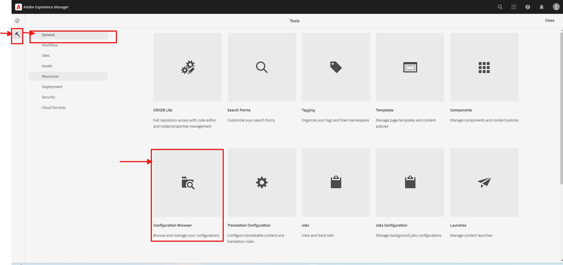
- Go to Tools → General → Configuration Browser.
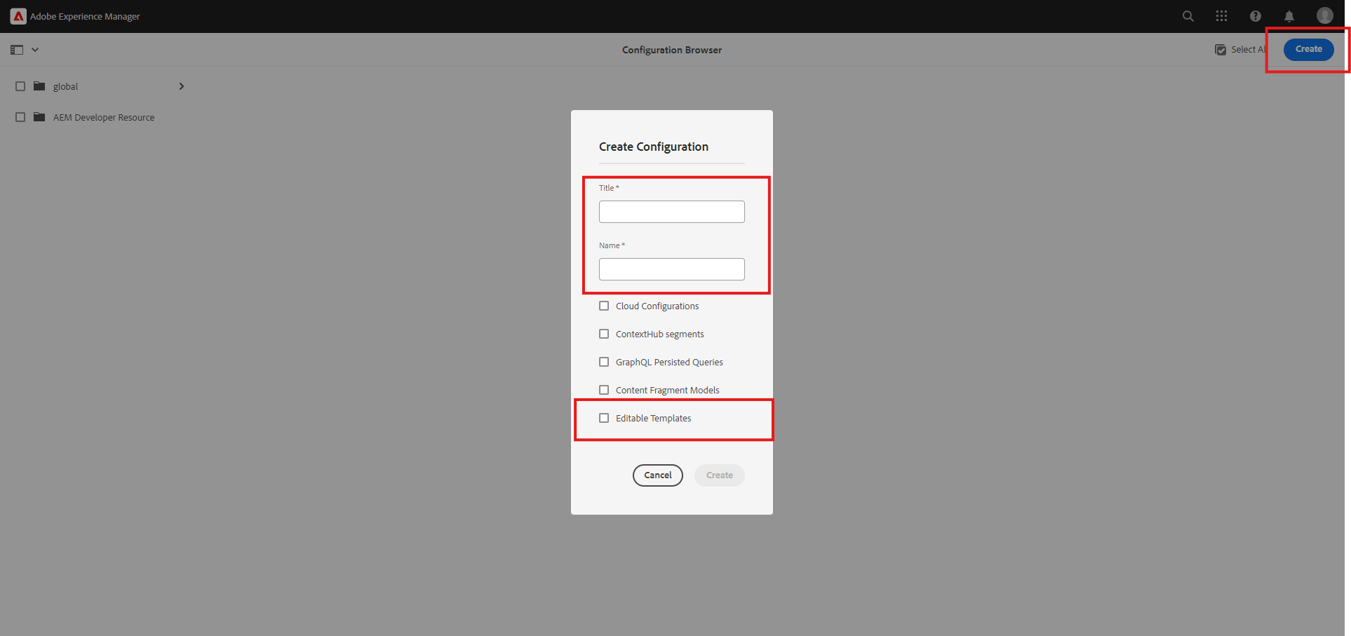
Click on Create Configuration and fill in:
- Title → Provide a name for the configuration folder.
- Enable Editable Templates → Check this option

- Open CRX/DE and check if the newly created folder is stored correctly
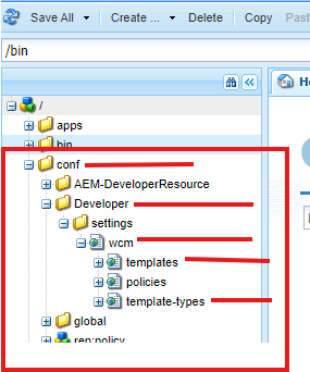
- Inside this folder, there will be a sub-folder named Template Type (it will be empty at first).

Step 3: Create a Template Type
- Go to Tools → General → Template Folder.
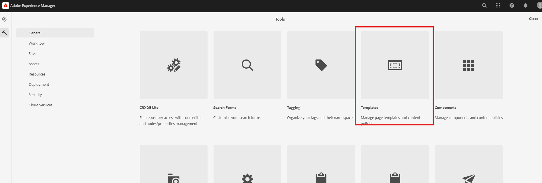
- Now you will be able to see the folder which is created earlier.

- Go inside the folder and Click on the Create Button.

You will find one template type that is coming from another resource. For example, it will check in the relative path if the template type is not available in our project.
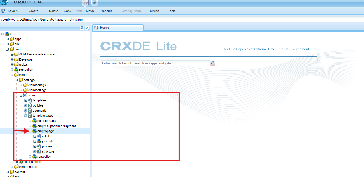
- /conf/myproject/myproject/settings/wcm/template-types
- /conf/myfolder/settings/wcm/template-types
- /conf/global/settings/wcm/template-types
- /apps/settings/wcm/template-types
- /libs/settings/wcm/template-types
Step 4: Copy an Existing Template Type (Recommended)
- Instead of creating a new one from scratch, you can copy an existing template type from another project (e.g., the WKND project).
- Paste it into your folder under template-types and rename the file accordingly.
Step 5: Modify the Template Type
- Inside the copied template type folder
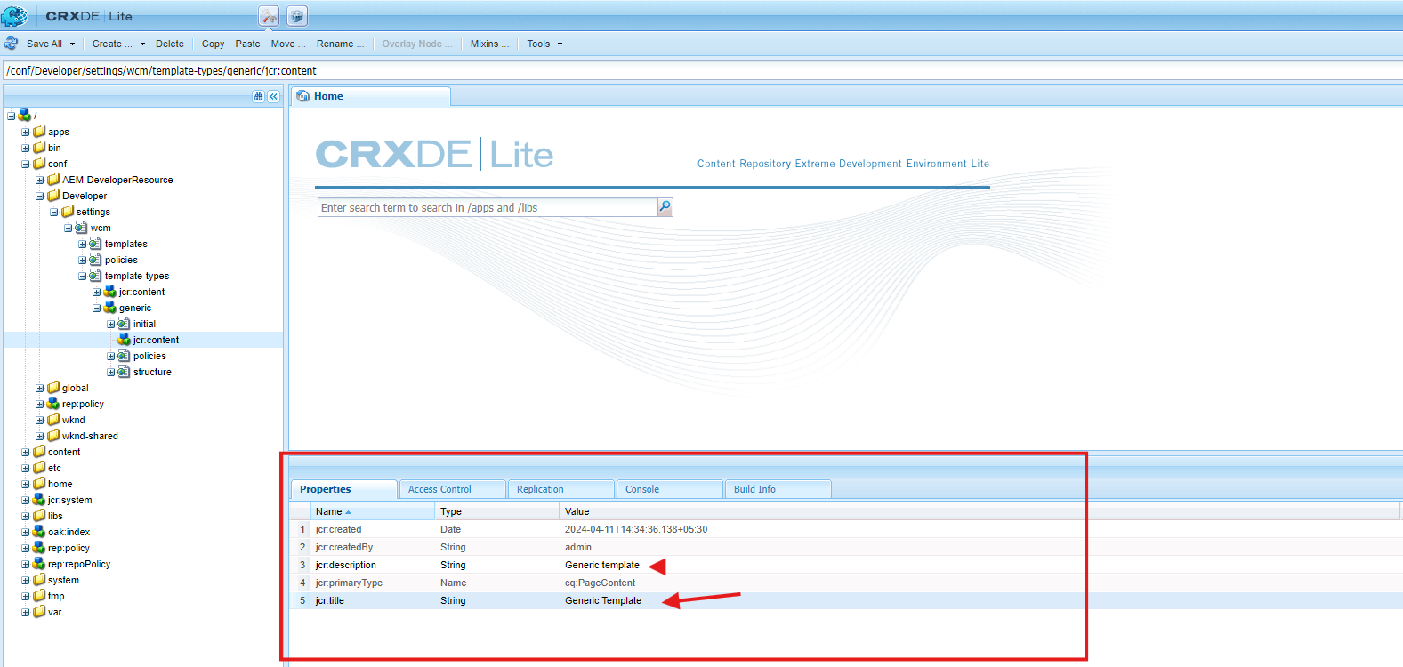
- Update jcr:content → Change jcr:title and jcr:description.
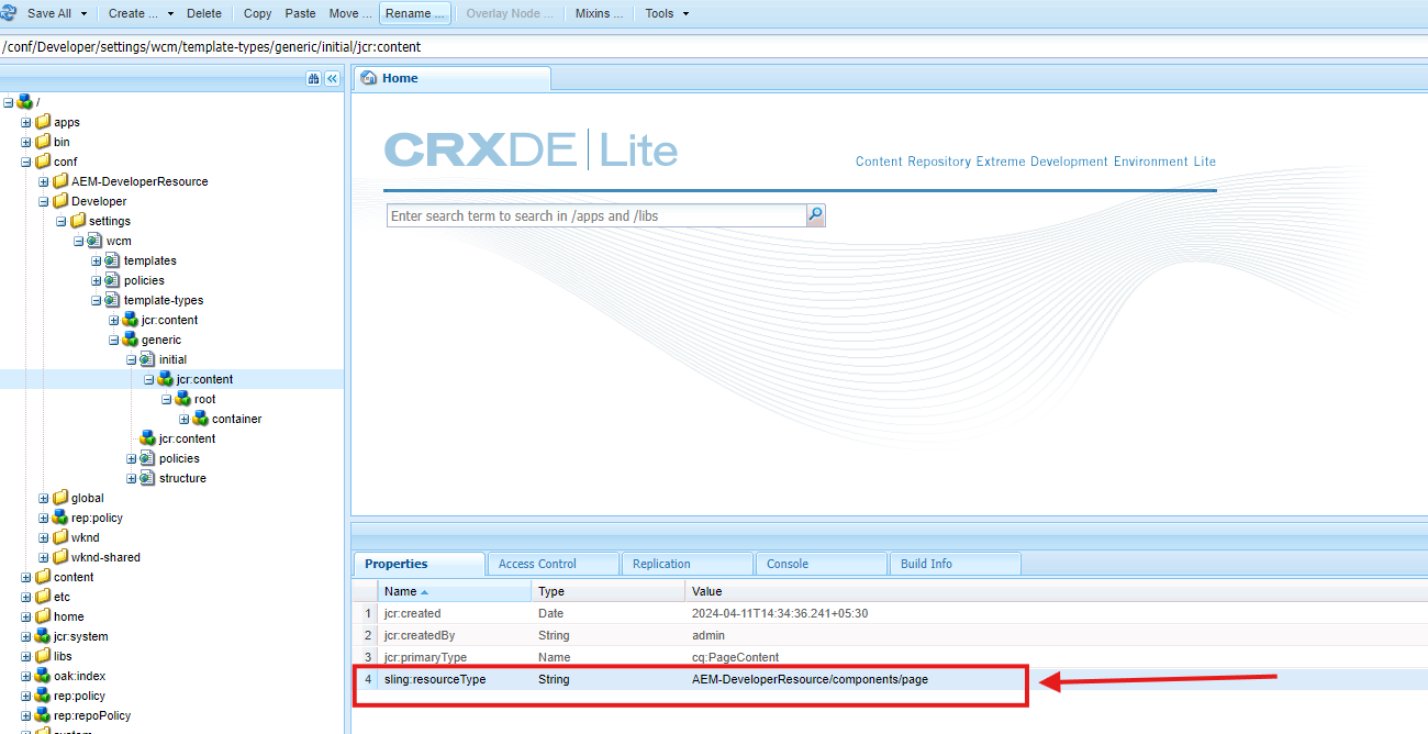
- Go to the initial content node → Update sling:resourceType to match the correct page component.
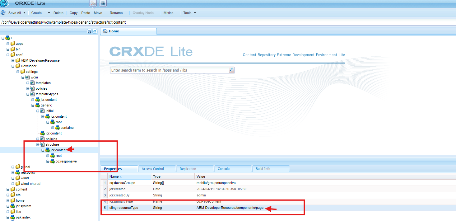
- Go to structure node → Update sling:resourceType to refer to the correct page structure
- Now, the template type is ready!
Step 6: Create a Template Using the Template Type
- Go to Tools → General → Templates → Open Your Project Folder.
- Click Create and choose the template type you just created.
- Select the template type and create a template
- Give a title

- Once you add the title click on Create button

- The template is successfully created and now you can use it for page creation.
10. Understanding the Editable Template Structure
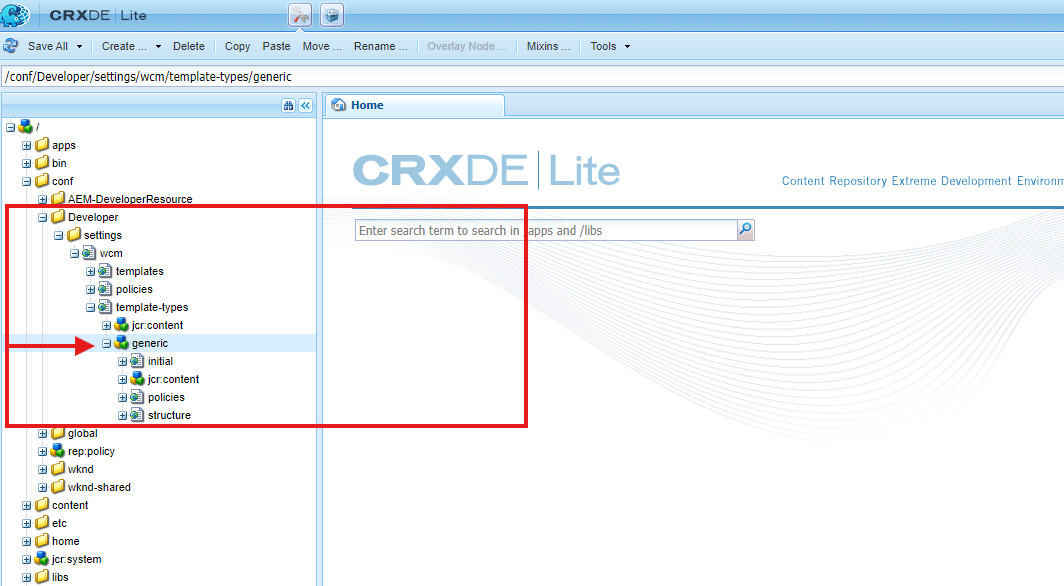
a. Template Type (cq: Template)
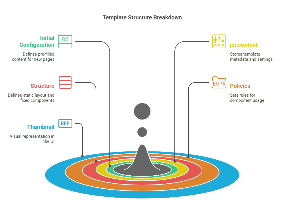
Template Type is like a blueprint for making a pre-defined template. It defines the base structure, allowed components, and any default content that should be included when a new page is created.
It contains several key configurations:
- initial
- This defines any pre-filled content that will automatically appear when a new page is created using a template.
- Example: If you want every new page to start with a banner at the top, you can define it here so authors don’t have to add it manually.
2. jcr:content
- This is where the template type’s settings and metadata are stored. Think of it as the template’s control panel.
What it contains
- Title (jcr:title) → The display name of the template type.
- Description (jcr:description) → A short explanation of what this template type is for.
- Resource Type (sling:resourceType) → Links to the page component that defines the template’s core structure.
- Other settings → Defines layout rules, allowed components, and other configurations that control how the template behaves.
3. structure
- The structure node defines the layout and fixed components for templates. once you add something to this structure node cannot be modified or removed by authors, when creating pages.
What it does
- Defines the static layout of the template.
- Locks certain components that should always be present (like a header or footer).
- Ensures consistency across pages using the same template.
Example: If every page must have a company logo in the header and a copyright footer, you define those here. Authors won’t be able to remove or edit them.
4. policies
- The policies define the design of the properties of a component, These apply to the template and page created using this template.
5. thumbnail.png: Represents the template visually in the UI.
b. Template (cq:Template and cq:templateType).
A Template is created using a Template Type as its base. It provides the structure and rules for pages. When an author creates a new page, they select a template, which defines how the page is set up.
similar structure
- initial: Used to define editable components and content available at page — creation.
- jcr:content: Contains metadata and template-specific details.
- structure: Layout and fixed components that cannot be removed.
- policies: Restrictions and permissions for components.
- thumbnail.png: Visual representation of the template in the interface.
11. Static and Dynamic Reference.
- Template Type ↔ Template: Static reference; changes in the template type do not affect existing templates.
- Template ↔ Pages: Dynamic reference; changes in the template reflect on all pages created using that template.
templates stored under /conf
12. let’s understand Structure | Initial Content | layout tabs
Open your template which created.
a. Structure Tab in AEM Templates
The Structure tab in AEM is where you set up the main parts of a template. It decides what will always be there when someone creates a page using this template.
What happens in the Structure tab?
- You add components that should not be removed, like headers or footers.
- If a component is locked, page authors cannot delete or move it.
- If a component is unlocked, it becomes editable when the page is created.
- Any changes made in the Structure tab will apply to all pages based on this template.
b. Initial Content Tab in AEM Templates
The Initial Content tab is where you define the default content that will be there when someone creates a new page from the template. Unlike the Structure tab, this content can be changed or removed by the page author.
What happens in the Initial Content tab?
- You add components that will be pre-filled on new pages.
- Page authors can edit or delete these components.
- It helps speed up content creation by providing a starting point.
13. Difference Between Structure Tab and Initial Content Tab
- Both the Structure tab and Initial Content tab allow adding components to a template, but they serve different purposes.

Example Scenario
Imagine you are creating a Product Page template
- Structure tab: You add a header, footer, and sidebar (these should always be there and cannot be removed).
- Initial Content tab: You add a product description and an image placeholder (authors can replace these).
14. What is the layout?
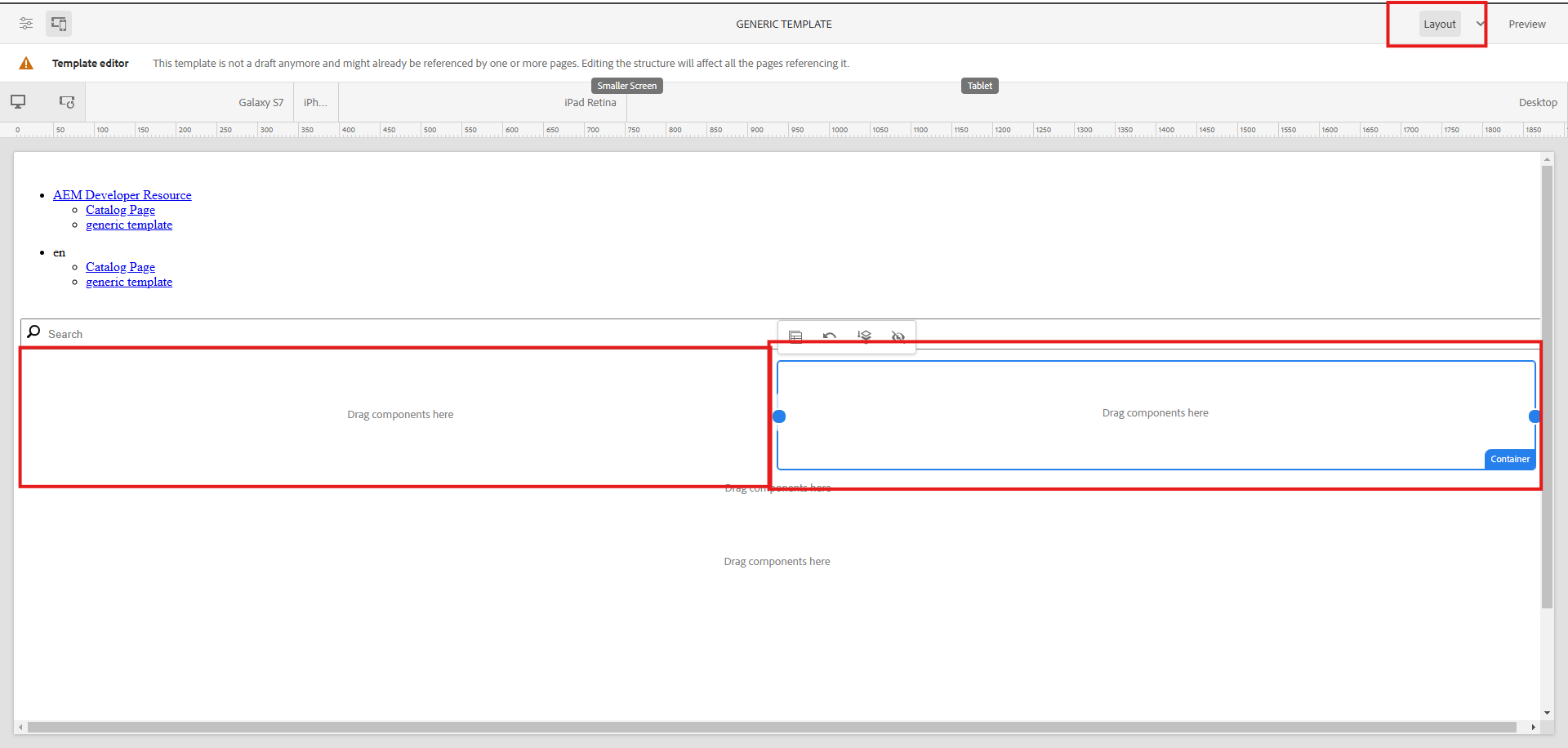
In AEM, a layout defines the structure and arrangement of components on a webpage.
It ensures a consistent visual design and responsive behavior across devices.
Layouts are implemented using Layout Containers and rely on CSS for styling.
15. Types of Layouts
- Fixed Layout — Width is fixed, suitable for desktops only.
- Fluid Layout — Adjusts to the screen size using percentage-based widths.
- Responsive Layout — Uses breakpoints to adapt to different devices (mobile, tablet, desktop).
- Grid-Based Layout — Arrange content in a structured grid of rows and columns.
16. What is a Layout Container?
A Layout Container lets you arrange components on a page. You can place text, images, and other elements in different sections.
How Does It Work?
You drag and drop components inside the container. You can move, resize, or arrange them as needed. It helps in making pages look good on all devices (mobile, tablet, desktop).
17. Layout Container
- A special component in AEM is used to create layouts.
- Allows authors to drag and drop components to arrange them on the page.
- Supports responsive design by allowing multi-column arrangements
18. Layout Policies
Define how the Layout Container behaves and what options are available to authors.
Examples:
- Restrict authors to 2-column or 3-column layouts.
- Allow specific spacing or alignment options.
19. Understanding Policies in AEM
When you create a template in AEM, you need to control what components can be added and define some rules to keep things consistent. That’s where Policies come in.
In older static templates, this was handled through Design Mode, but in editable templates, we now use Policies instead.
20. What is a Content Policy?
A Content Policy is like a rulebook for a template. It controls
- Which components can be used inside the template?
- How those components behave (styling, settings, etc.).
There are two main types of policies:
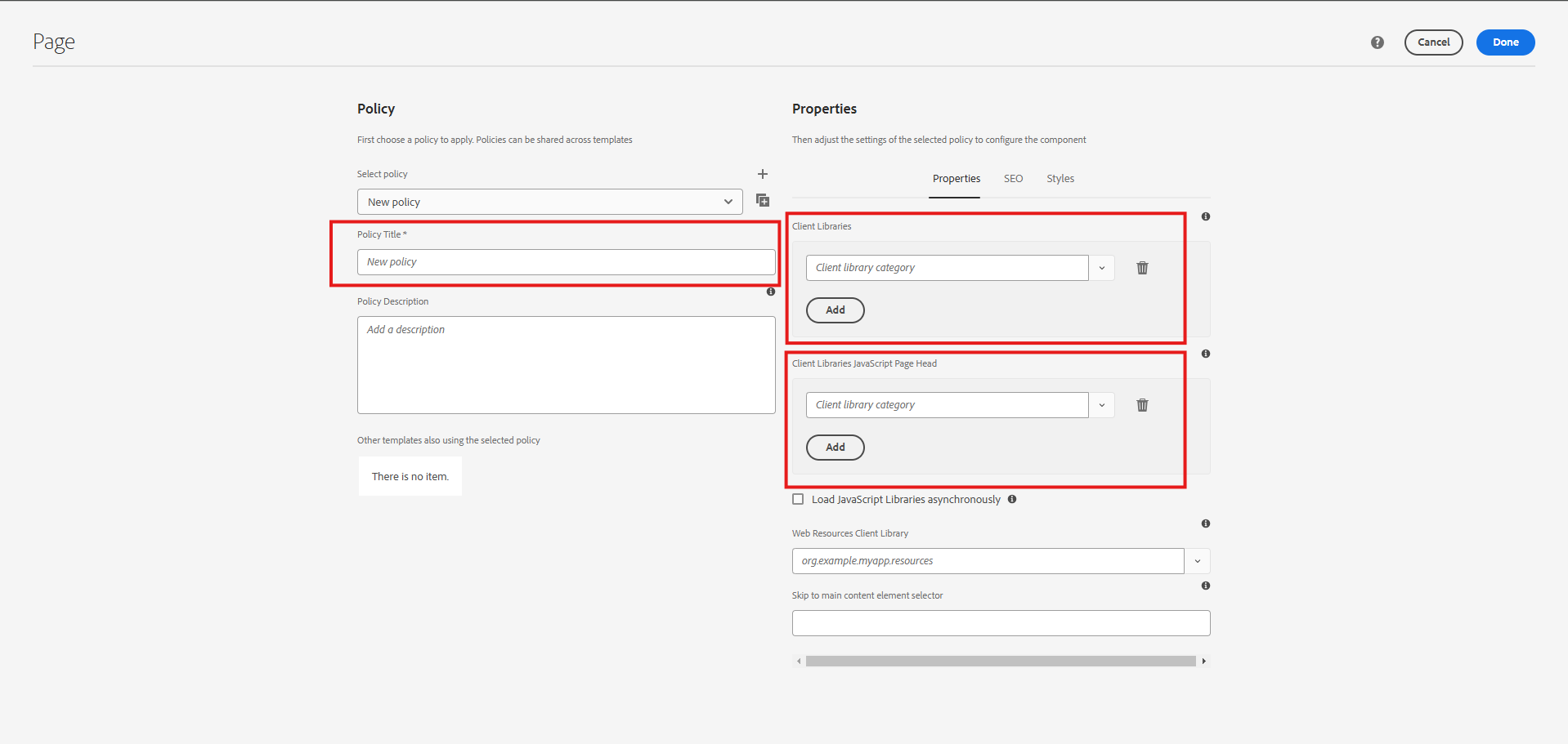
- Page Policy — Defines global behaviors like client libraries, main selectors, etc., for all pages created using a template.
- Component Policy — Specifies allowed components and configurations for different template parts (e.g., parsys, containers).
21. Page Policy: Setting Rules for the Page
The Page Policy decides what settings apply to every page created from a template.
How to set up a Page Policy
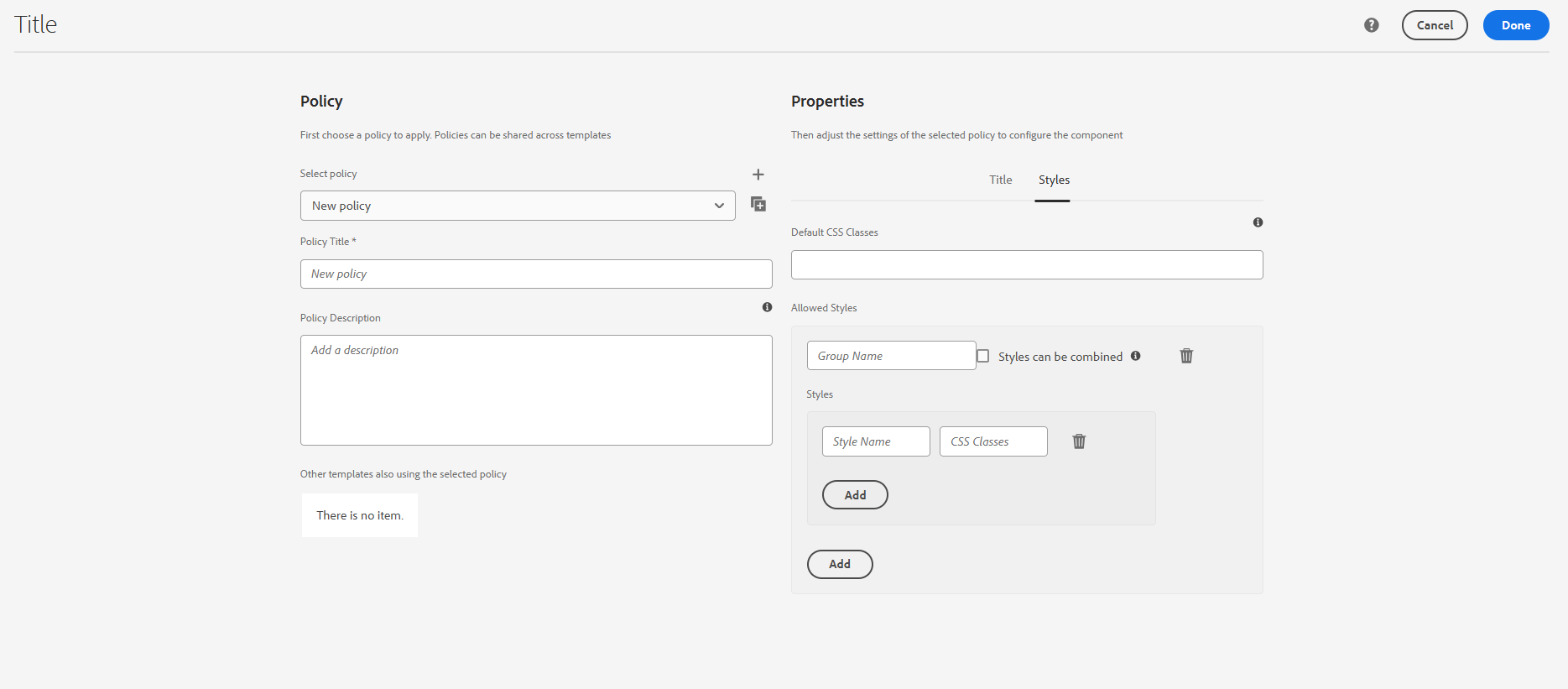
- Open the Template Editor and find the Page Policy settings (click the three dots).
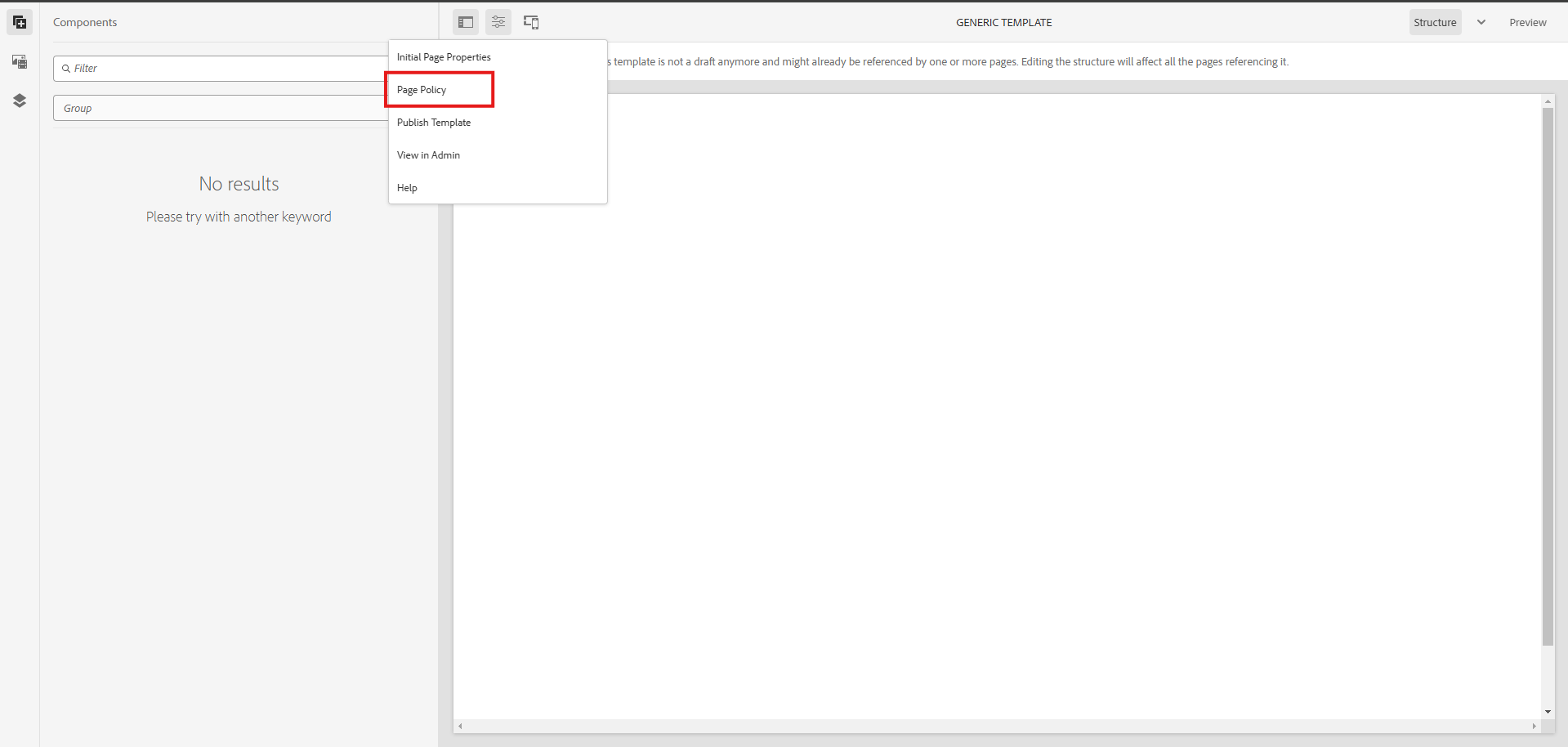
Define things like
- Client Libraries (CSS & JavaScript files used on the page).
- Main Selector (helps AEM identify the main content area).
- JavaScript in Head (scripts that should load before the page appears).
- Save it, and now all pages using this template will follow these settings.
22. Global Policy
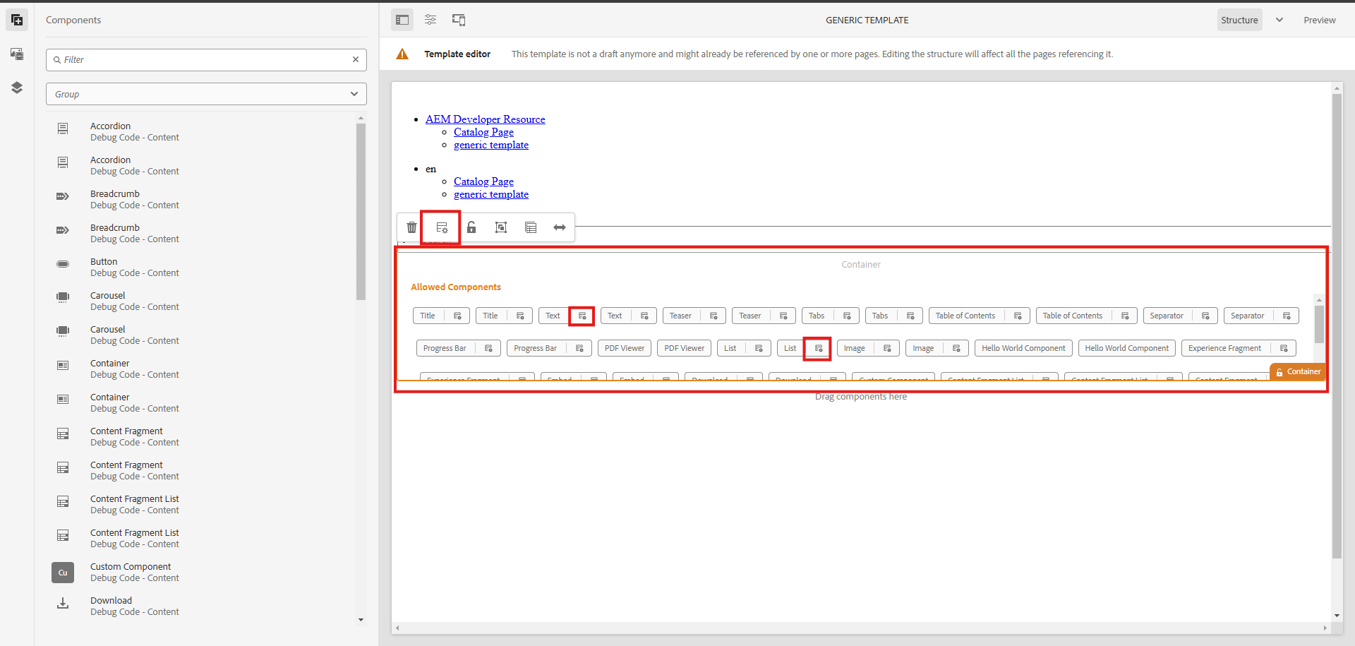
Steps to Add a Component Policy.
- Select the Container/Parsys in the Template Editor.
- Click the Policy Icon and create a new policy or reuse an existing one.
Define things like
- Allowed components (e.g. AEM Developer Component Content).
- Default components (optional auto-mapping based on media type).
- Other options like background images, responsive columns, and styling (Style System).
- Save it and refresh the page to see the allowed components.
23. Component-Specific Policy.
Some components need their own rules because they might contain nested components or require custom settings that a general policy shouldn’t control.
Steps to Add a Specific Component Policy.
- Select the component → Click Policy Icon → Define a policy specific to the component.
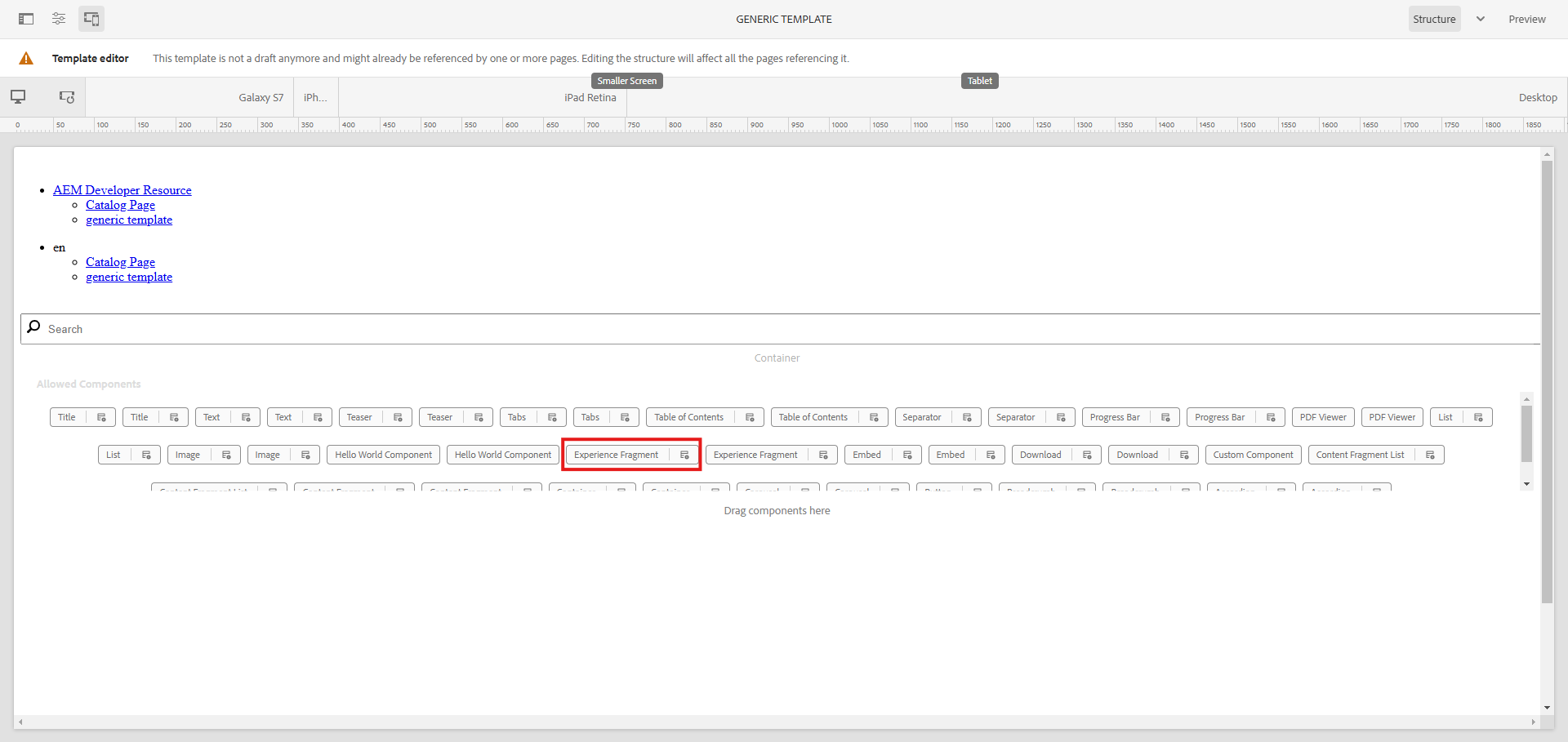
- This will override the parent container’s policy.
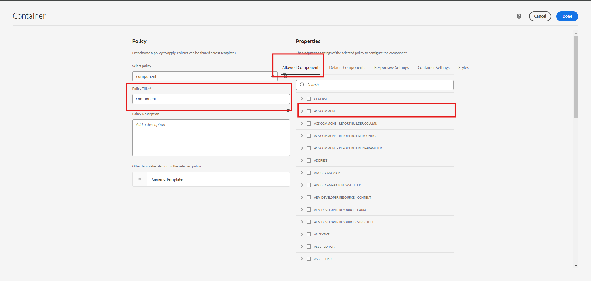
Define things like
- Allowed components (e.g. AEM Developer Component Content).
- Default components (optional auto-mapping based on media type).
- Other options like background images, responsive columns, and styling (Style System).
Save it and refresh the page to see the allowed components.
Once applied, this policy will override the parent container’s policy, meaning this component will follow its own rules rather than inheriting the container’s settings.
24. Storage of Policies
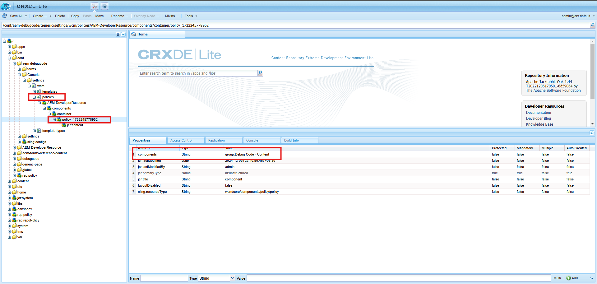
- Open CRXDE. — http://localhost:4502/crx/de
- Policies are stored under
- conf//settings/wcm/template/policies
- At the template level, only references to actual policies will be available.
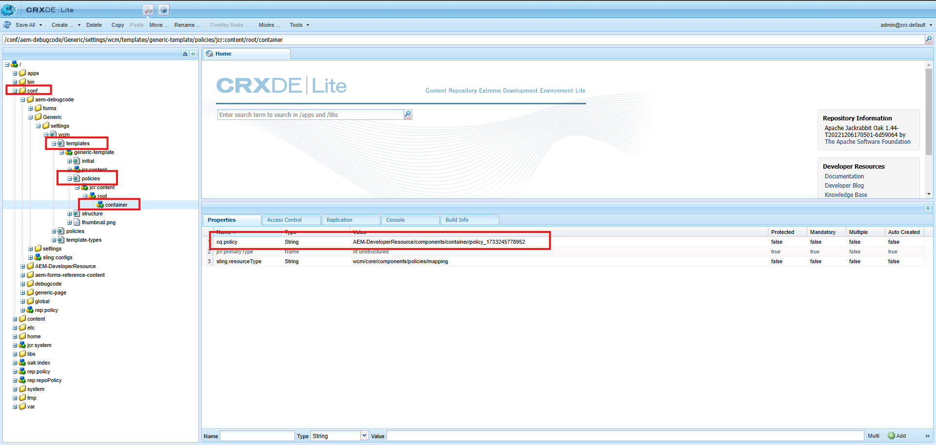
- Actual policies are stored under policies tabs.
- You can see the reference number will be the same in the template and policies.
- You can component group you enabled.
25. Style System in Editable Template
The style system in editable templates enables applying reusable styles to components and pages.
The purpose is to Avoid creating or modifying components for different UI needs.
Usage.
- Content authors and template authors can define styles.
- Styles can be reused across pages and components.
style system is classified into two types.
- Page-Level Style System
- Component-Level Style System
26. Page-Level Style System
let’s understand page-level style.
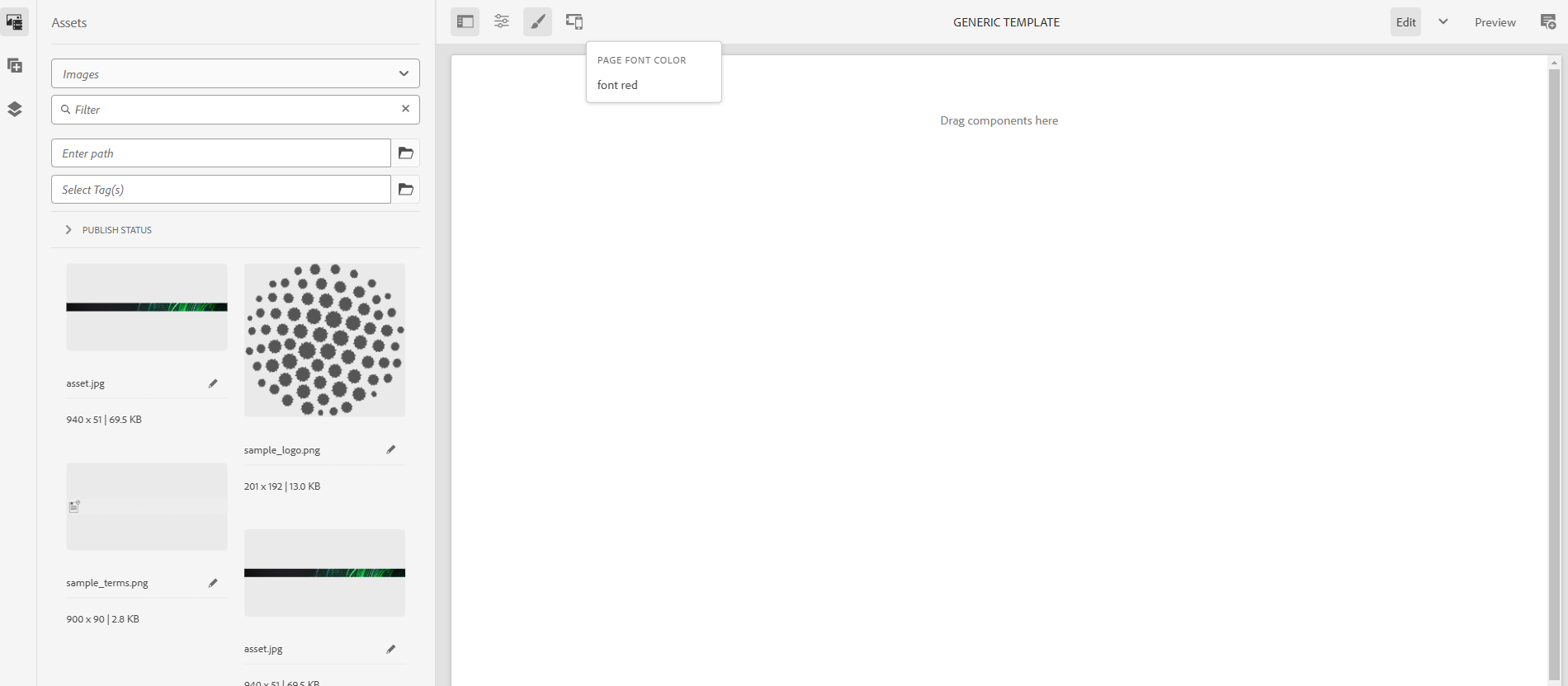
- Navigate to the template editor.
- Access Page Policy via the three-dot menu.
- Define style groups under the “Styles” tab.
- Example: A group named “Font Color” with options like “Red,”.
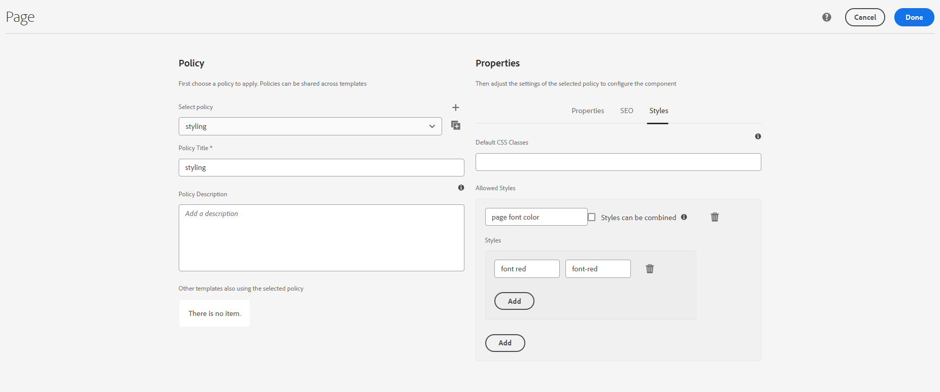
- Add the corresponding CSS for the classes defined in your project.
27. Component-Level Style System
lets us understand Component level style.
- Open the template editor.
- Click the Policy Icon for the component.
- Define styles specific to the component.
- Example: Alignment styles like “Left,” “Center,” and “Right.”
- Add CSS for the defined styles.
28. Combination of Page and Component Policies
Sometimes, you need a mix of page and component policies to achieve advanced designs.
Scenario.
- You’re building a blog platform where.
- The page background changes based on the category (e.g., Technology = blue, Lifestyle = green).
- Individual blog titles need font size customization (e.g., small, medium, large).
Page Policy: Define background colors for categories, category-tech, category-lifestyle, etc.
Component Policy (Title): Add font size options for the title font-small, font-medium, font-large.
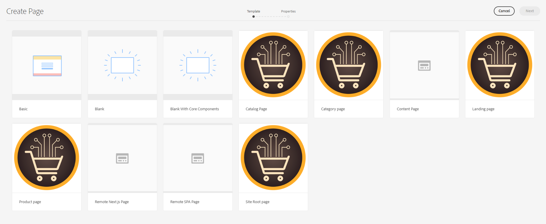
29. Creating Page Using Template
- Go this URL → http://localhost:4502/sites.html/content/<your_Project>/us/en
- Click on Create and Select Template

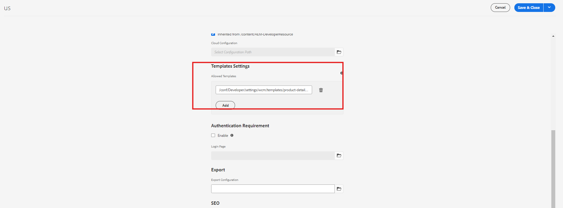
- you need to find your template in it. if your template is not visible
- The template is in draft mode
- Template is not allowed
Let’s make the template from the draft to enable state.
After enabling still you are still not able to find the template
Next, you add in page properties under US → page properties


Every great discussion starts with a simple thought! If you enjoyed this article, found it useful, or have any questions, let’s talk! I’d love to hear from you.
For more updates, tips, and engaging conversations, connect with me on Medium, LinkedIn, and RealCodeWorks. Let’s keep learning together! 🚀✨
Thank you 🙏 !
